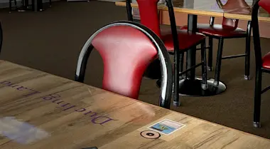
Sep 21, 2021 — Path to WPN Premium
Path to WPN Premium: Store Signage
Interior signage tells players a lot about your store before they even cross the threshold. Signage should set the tone for your store, amplify your brand identity, and most of all help make customers feel welcome. How do you achieve great signage that sets your location apart from others? Today we’re highlighting critical Dos and Don’ts.
Signs inside your store are an excellent and relatively easy way to improve the customer experience quickly. A great sign can have a big impact, especially if you’re pursuing WPN Premium.
If executed well, store signage can be the difference that motivates players to choose your store over another.
Many shoppers appreciate the unspoken communication that clear signs offer. In the words of Retail Development Specialist Rob Dunbar, store signage is “an inexpensive extra employee, doing work for you—all the time.”
The signs throughout your retail space don’t have to be professionally commissioned, or even professionally designed to improve the look and feel of your store. Using consistent formatting, font choices, and colors go a long way.
The process of getting the signs was challenging, as it was not something we had ever thought about in a systematic and deliberate way. Now that the signs are up, I am very happy with how they look and the impact they have.– Lincoln Erickson, Rook’s Games and More
Let’s dive into our top three store signage dos.
Do keep things consistent. Identify a core set of colors, fonts, and logo you want to use--and stick with them. Create a template that can be replicated and updated as needed over time.
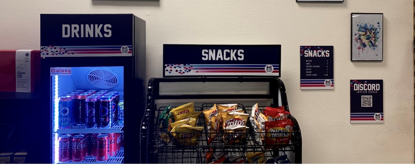
Do show some personality. If your store has a larger-than-life mood or irreverent sensibilities—signs are a great way to put that on display! The way you communicate with players should carry through to every interaction they have in your store, and signs are no exception.
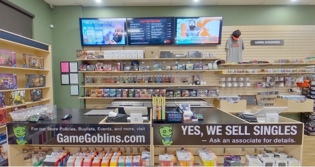
Do embrace simplicity. Players should be able to gather information quickly that helps them guide their own experience. Whether it’s to identify new products, special promotions, or even where the restrooms are located, signs should assist in a customer’s navigation of your store.
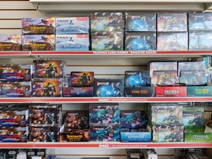
Now on to a few common pitfalls that are store signage no-nos.
Don’t say too much. Be clear and concise so that signs can be read at a glance.
Don’t distract from the point. Using busy background images or distracting watermarks behind the words on your signs can make them difficult to read. The message you’re trying to communicate may get lost in the design, potentially leaving customers confused.
Don’t underestimate scale. No one likes to squint to read. Consider how your signs look when standing a few feet away. The size of font you use can make all the difference. Above all else, your signs should be functional and practical rather than space-saving.
Still stumped on store signage? Your Retail Development Specialist is available to talk you through these, and many other improvements to your store to help you get on the fast track to WPN Premium. Apply today to see where the conversation takes you.
WPN Premium
Level Up Your WPN Membership
Learn MoreNot a Member Yet?
Apply to Join the Wizards Play Network Today
Visit our support site, select your region, and submit a request to apply.


